
This is a micro-eLearning solution. I designed it to help a client language organization create Conversational Chinese micro-eLearning curricula.
The client is a language company. I collaborated with them over the years, designing and developing in-person Chinese curricula for adult professionals working in technology and finance.
Before the burst of COVID-19, the language company had already encountered a staff shortage. There were not enough self-paced, flexible learning programs to meet learners’ needs either. Furthermore, their Chinese programs focused heavily on vocabulary building, pinyin recognition, character writing, and grammar lessons. Conversational Chinese programs have been underdeveloped. The need for conversation-focused curricula has been increased.
During COVID-19, the situation of instructor shortage was getting worse. Their instructors were not available or reluctant to teach in-person classes, especially conversation-focused classes. The language company was not able to provide enough services and started to lose customers.
The language company came to me. We discussed and identified the challenge:
After conducting a market analysis and interviewing 16 adult professionals working in technology and finance, I propose a mobile, micro-eLearning solution.
This solution is ideal because:
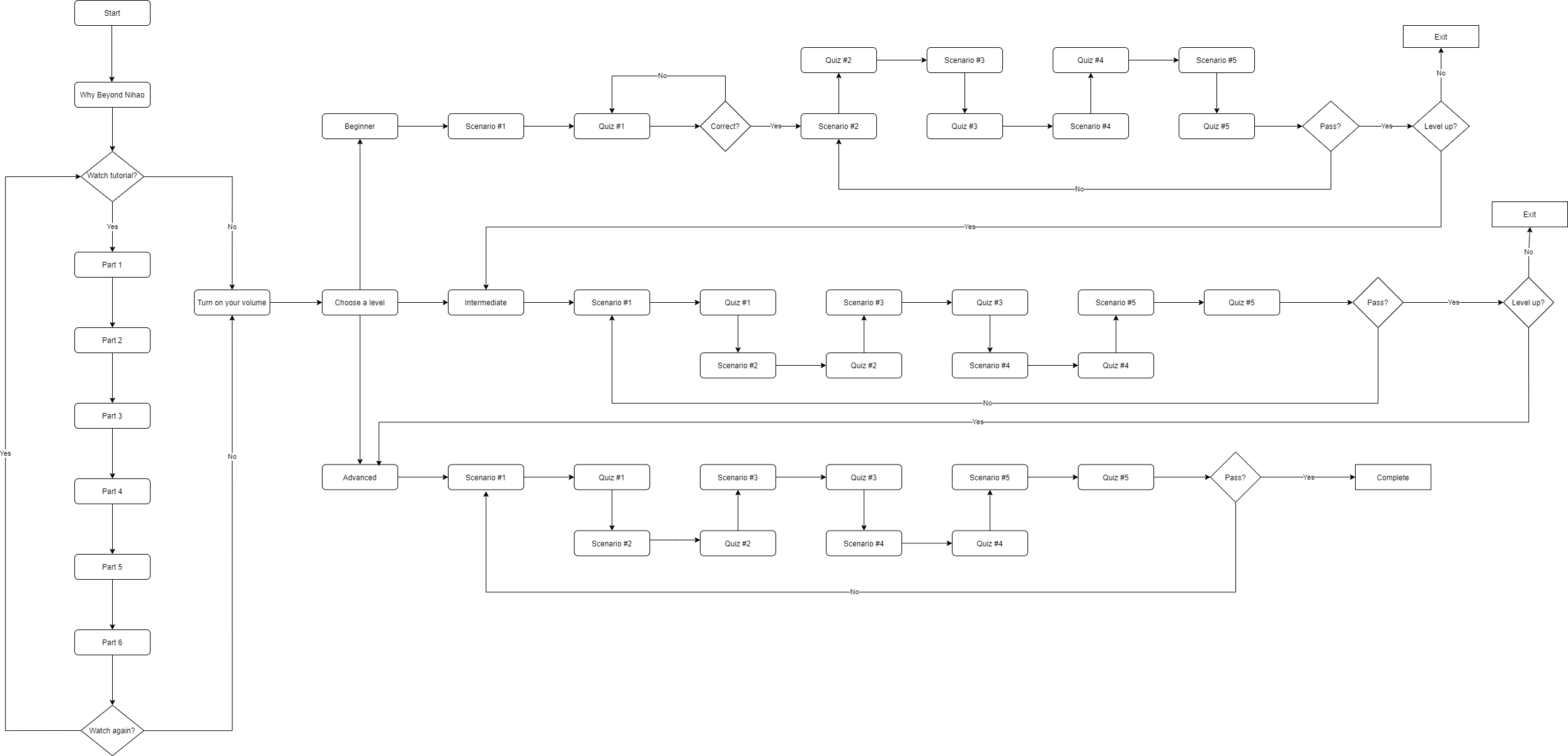
I approached the challenge above with instructional design and UX learning design methodologies. The following flow chart shows my process.

I started by conducting a market analysis and then having in-depth interviews with 5 different target users.
Market Analysis:

The language learning apps above are popular among language learners. These apps have different strengths and weaknesses. Duolingo, for instance, is extremely playful and has a beautiful, minimalistic design, but its content mainly focuses on vocabulary building and word and phrase recognition. FluentU has dynamic, video-based content, but its design is complex and its content overwhelming. Babbel, by contrast, has a clean, careful design and provides right amount of content to learners on different levels. It seems a great solution to the challenge above. However, it does not offer Chinese lessons.
To address the challenge, we need to find a new solution.
Interviews:
Among the 5 in-depth interviews I have done, there are common concerns regarding the language apps the interviewees used and their expectations for a new solution.
“I am using an app that helps me learn new words, but they are fairly isolated. I couldn’t construct sentences and speak confidently. I feel stuck.”
“There is a lot of information on the app I use. Sometimes, I find it overwhelming and distracting. I can’t remember the words and sentences after I close the app.”
“I wish there is an app that provides the right amount of words and sentences. At the same time, I want it to do one thing and do it very well.”
Based on the market research and interviews, I created a user persona. It helped me focus on one person and find pain points and opportunities for the target users.

Guided by this user persona, I created a storyboard. This storyboard centered around Michelle's motivations for learning Conversational Chinese, as well as her experience in searching and using language learning apps.

This storyboard, along with the persona, helped me identify and understand our target users’ pain points.
Based on the pain points, I formulated a problem statement, specifically focusing on Michelle’s goals, needs, and the pain points she experiences.
Refining the problem statement allowed me to use different tools and generate new ideas in the following steps.
When I was creating a user flow, I applied the "less is better" design principle and the learning technique of spaced repetition. The user flow, at a high level, shows the path a user can take in their language learning journey.
From the user flow, I began to create a low-fidelity mockup in Adobe XD. It represents the information architecture of the future layout.

I want to create a warm and welcoming experience for learners. To capture such an experience, I made a mood board and capture the warmth and friendliness of the User Interface.

Based on the mood board and user interface design above, I began collecting characters, creating scenes, and making the mid-fidelity mockups, including elements of typography, colors, icons, illustrations and different screens.


At the same time, I also created another color scheme to compare and contrast with the mockups above.

Based on the feedback, I chose color scheme 1, which conveyed the warm and welcoming style of this app.
To accommodate my design, I edited the conversation scenarios in Adobe Illustrator, including characters, speech bubbles, and buttons.
For instance, I revised the icons on the conversation screens to visually differentiate their functionalities and add accessibility.


To keep usability heuristic in the design, I paid special attention to key visual principles, including alignment, proximity, contrast, and consistency. These principles guide me to create high-fidelity mockups with all the screens.

After finishing the visual mockups, I sent them to a group of target users and the client company and received feedback.
With the visual mockups in place, I quickly create interactive prototypes in Articulate Storyline. More details are coming up.
After the interactive prototypes were made, I conducted usability testing. More details are coming up.
After conducting the testing and collecting user feedback, I developed the final product in Articulate Storyline 360 and implement xAPI to track user performance.
When the user interacts with the eLearning solution, it executes JavaScript that sends xAPI statements to a Learning Record Store (LRS).
More details are coming up!